See Demo at the bottom of the page.
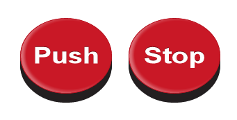
With the new features that CSS3 have creating a variety of button. In this example, radius of the border, padding the button, the height and width modified, it can look like a circle. And added the rotateX property that currently only supported in web kit browser, to make it look like from different angle.
With the new features that CSS3 have creating a variety of button. In this example, radius of the border, padding the button, the height and width modified, it can look like a circle. And added the rotateX property that currently only supported in web kit browser, to make it look like from different angle.
This all the simple code.
<!DOCTYPE html>
<html>
<head>
    <title></title>
    <meta http-equiv="Content-Type" content="text/html; charset=UTF-8">
    <style type="text/css">
    body {
        font-family: Arial, sans-serif;
    }
    #container {
        margin: 120px auto;
        text-align: center;
    }
    .button {
        -webkit-transform: rotateX( 35deg );
        position: relative;
        display: inline-block;
        width: 100px;
        padding: 42px 15px;
        margin: 0px 10px;
        background-color: #C91826;
        color: #fff;
        font-weight: bold;
        font-size: 40px;
        text-decoration: none;
        text-align: center;
        text-shadow: 0px -1px 0px rgba(0,0,0,0.5);
        border: 1px solid;
        border-color: #B21522;
        border-radius: 78px;
        -moz-border-radius: 78px;
        -webkit-border-radius: 78px;
        box-shadow:   inset 0px -4px 5px rgba(255,255,255,0.2),
                            inset 0px 1px 5px rgba(255,255,255,0.2),
                            /**/
                            0px 12px 0px #231F20,
                            0px 14px 0px #231F20,
                            0px 16px 0px #231F20,
                            /**/
                            0px 8px 5px rgba(0,0,0,0.5);
        -moz-box-shadow:  inset 0px -4px 5px rgba(255,255,255,0.2),
                            inset 0px 1px 5px rgba(255,255,255,0.2),
                            /**/
                            0px 12px 0px #231F20,
                            0px 14px 0px #231F20,
                            0px 16px 0px #231F20,
                            /**/
                            0px 8px 5px rgba(0,0,0,0.5);
        -webkit-box-shadow: inset 5px -4px 5px rgba(255,255,255,0.2),
                            inset 5px 1px 5px rgba(255,255,255,0.2),
                            /**/
                            0px 12px 0px #231F20,
                            0px 14px 0px #231F20,
                            0px 16px 0px #231F20;
    }
    .button:hover {
        background-color: #B21522;
        color: #e3e3e3;
    }
    .button:active {
        top: 8px;
        box-shadow:   inset 0px 4px 5px rgba(255,255,255,0.4),
                            inset 0px -1px 5px rgba(255,255,255,0.2),
                            /**/
                            0px 8px 0px #231F20,
                            /**/
                            0px 9px 5px rgba(0,0,0,0.5);
        -moz-box-shadow:  inset 0px 4px 5px rgba(255,255,255,0.4),
                            inset 0px -1px 5px rgba(255,255,255,0.2),
                            /**/
                            0px 8px 0px #231F20,
                            /**/
                            0px 9px 5px rgba(0,0,0,0.5);
        -webkit-box-shadow: inset 0px 4px 5px rgba(255,255,255,0.4),
                            inset 0px -1px 5px rgba(255,255,255,0.2),
                            /**/
                            0px 8px 0px #231F20,
                            /**/
                            0px 9px 5px rgba(0,0,0,0.5);
    }
    </style>
</head>
<body>
  <div id="container">
    <a href="http://template4.blogspot.com/" target="blank" class="button">Push</a>
    <a href="http://template4ublog.blogspot.com/" target="blank"" class="button">Stop</a>
  </div>
</body>
</html>
source article : Create CSS Circle Button

0 comments:
Post a Comment